Above and Below the fold Ad zone placement strategies for Publishers

When looking at the overall layout of your site, there are two main sections to take into consideration: Above the Fold and Below the Fold. Because they are different parts of the end user journey, it is important to take them into consideration when thinking about ad zone placement, and to be strategic. In this article we tell you ad zone placement strategies for Publisher for Above and Below the Fold zone placement, and we will get into how to place first screen ad zones to help you boost your website’s ad revenues. Keep reading for high-impact ad zone tips for Publishers!
What is Above the Fold and Below the Fold in digital advertising?
Above the Fold in digital advertising makes reference to the upper area of a website page, often the 600 pixels from the top of the site to the bottom of an end user’s browser window, without scrolling down, depending on device and browser settings. This is the first section of a page that end users will see, and according to a study by the Nielsen Norman Group, end users spend 57% of their time Above the Fold, making Above the Fold prime advertising space.
The Below the Fold section is only visible after scrolling down the page. Not all end users will make it to this section, generally those who are enjoying the content and decide to continue exploring, so it still holds value and ad revenue possibilities.
When placing your ad zones on each section, it is important to keep testing different formats and zone combos to see what works best, and to optimize them over time. To help you to find your perfect formula, we have put together a few Mobile and Desktop best zone placement practices for Above and Below the Fold.
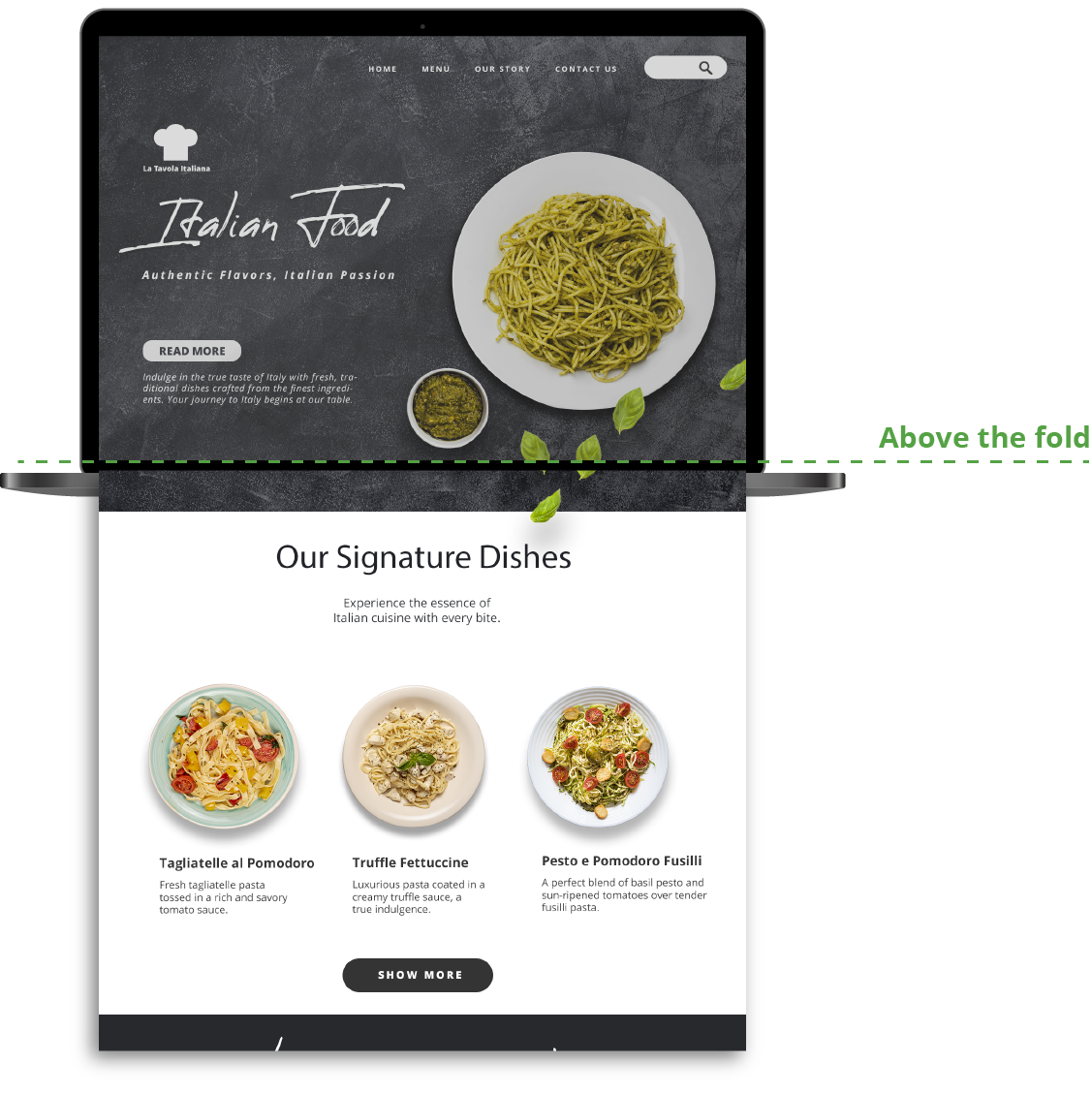
Ad zone placement strategies for Publishers for Above and Below the Fold
Now let’s get into a few ad zone placement strategies for Publishers. For Above the Fold, Publishers must consider the balance between the amount of content in relation to the amount of ads. If ads outbalance content, Google will most likely penalize you. Also, end users could get annoyed and leave, increasing bounce rates and decreasing traffic. So it is important to be intentional with the amount of zones and the chosen ad formats.
High-impact ad zone tips for Publishers for Above the Fold on Mobile
A huge percentage of end users use Mobile. Since the screens are smaller and there’s more scrolling involved, you need to be strategic about space usage and really take into consideration what are the best formats for top of page zones on Mobile. Here are a few high-impact ad zone tips for Publishers:
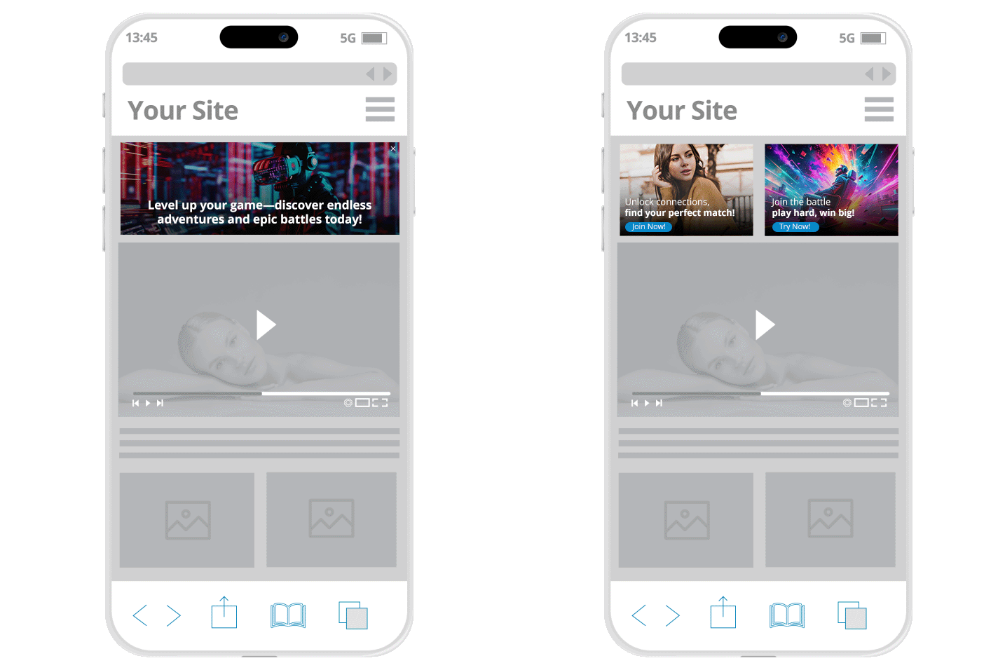
Header Multi Format Ads: Maximize revenues for this high demand zone by using Multi Format combos. For instance, Mobile Header Banner 300×100 + and Native 2×1 or Native 1×1.
Menu Tabs: To optimize the reduced screen space, use emojis instead of words (e.g, ❤️ for Dating, 🎮 for Gaming) on your Menu Tabs. This is especially useful if the Mobile version of your site has a burger menu to save space. If you are using a horizontal menu, place your Menu Tab zones at the very left of the screen so that they are seen first. Or, you could have two different navigation menus: A Burger Menu for your overall website navigation, and a horizontal Menu Tab zones one.
Under Video Banner: Like the name indicates they appear under the Video player, which is great for Mobile because it won’t take space on the laterals. You could use MFAs to rotate 300×250 + 300×100 duplicated vertically + native 2×2 + native 2×1 + native 1×1.
In-Stream: This popular Video format automatically plays inside of the Video player when a user clicks on a piece of Video content on your site. It is ideal for Above the Fold Video Mobile pages, since it won’t take any extra space. The format also works on Desktop.
What are the best formats for top of page zones on Desktop? Above the Fold ad zone placement tips
For Desktop, you will have more overall screen and also lateral space to place your ad zones. You can enable larger formats, longer Native rows, etc. Here are some Above the Fold ad zone placement tips:
NTVA, NTVB, NTVC MFA Desktop placements: For NTV we can rotate: 300×250, 300×100 duplicated vertically, native 1×1, native 2×2, native 1×2 with text on the right, and under video Banner to rotate 728×90 + Native widgets customized to look like Video thumbnails.
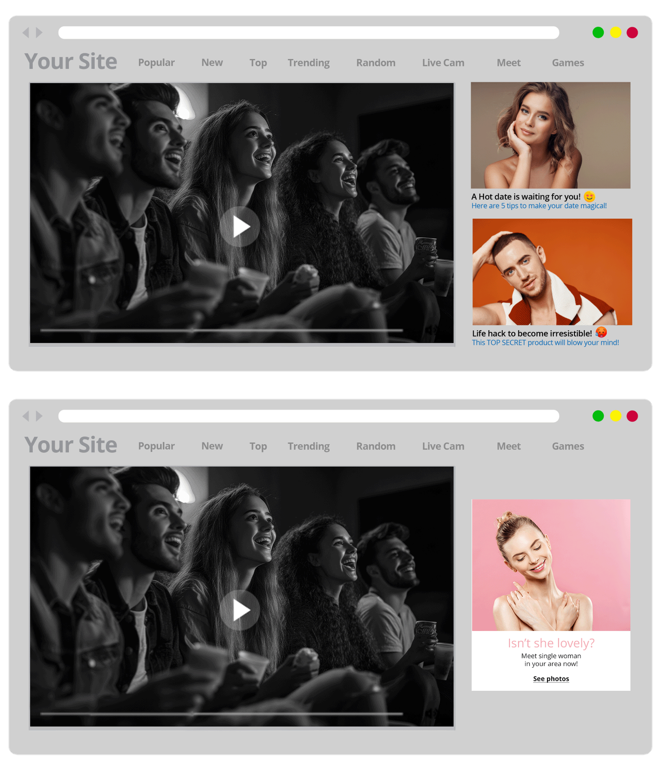
In-Video Banner: This Banner is displayed within a Video player and can be placed pre-roll, when the user pauses the video, or on post-roll. This works very well for Desktop, but it is also available on Mobile.
Native: Native zones can be placed within your site’s content, for instance on a gallery/Video page, or categories page. You could test out different widget types such as 1×4, 2×2, 1×3, or in the Video recommendations below a main piece of Video content. If you have a Members Area website you could also try 1×1 In-Content Native widget zones.
Ad formats and best practices for Below the Fold Advertising: Publisher tips for attention-grabbing ad zones
If you are wondering what ad formats to use Below the Fold, we will now look at a few ad zone placement strategies for Publishers for Below the Fold. Most Below the Fold sections contain additional content, page number bar, Footer links, extra category tags, and so on. Or some pages endlessly load new content upon scrolling down. So, although not all end users will make it to this section of your site, it holds a lot of ad zone and combo testing possibilities. In this section we will give you top Publisher tips for attention-grabbing ad zones.
What ad formats to use Below the Fold on Mobile? Best practices for scroll-triggered ads
Middle and Footer Mobile: Once again using MFAs, you could test out a few combos, such as Mobile 300×250 (Middle or Footer) Banner 300×100 + Native 2×2 text over image + Native 1×2 text on the side.
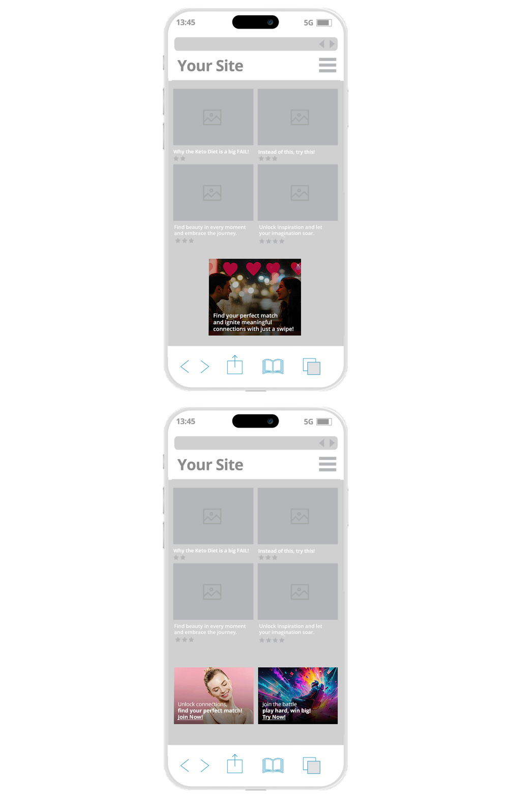
Best practices for scroll-triggered ads with Outstream: What ad formats to use Below the Fold? This format is great for it, both on Mobile and Desktop. The Video is triggered wherever the ad zone is placed during the user journey, and is self-contained. Multiple Outstream zones can be placed as the end user scrolls down, so it works well for infinite scroll pages.
Direct Links: You could add some extra Direct Links at the navigation links and categories section of your Footer section. Or if you have a comments section, you could also add some extra Direct Links there.
Below the Fold Desktop high-impact ad zone tips for Publishers
In-Content Outstream/Native: Here are a couple of bottom of page ad tips for Publishers. If you have a long scroll Video or gallery site, add an Outstream Video placement Below the Fold, between the 2nd or 3d thumbnail and combine it with a Native 1×1 widget within the 5th & 6th thumbnails.
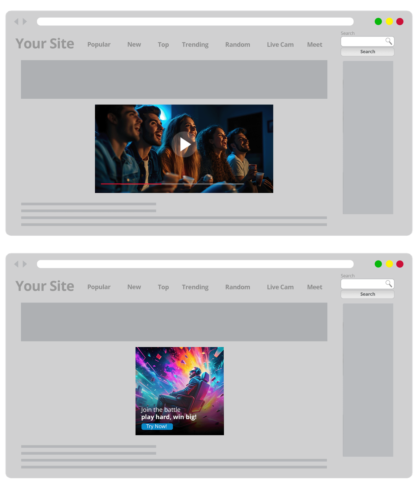
MFA In-Content Desktop Banner zones: Depending on the layout of your site’s layout you could test out a few Multi-Format In-Content Banner (300×250) zones to merge with the content. Because they are MFA zones, the Banner placements will compete against Native widgets of different layouts. This is one strategy on how to use In-Content ads below the fold.
Large Banner Footer: Because it is Desktop and you have more space, you could test out placing a Large Footer Banner 900×250 at the bottom of your site. You can make it a MFA zone with a 900×250 + 300×250 Banner duplicated horizontally + Native 4×1.
Ad zone placement strategies for Publishers: Get in touch with the team!
Do you want to learn about more ad combos and more ad zone placement strategies for Publishers? Get in touch with our team here and get more high-impact ad zone tips for Publishers and below-the-fold ad strategies!
Elevate your Online Advertising skills! Join ExoClick Academy, our free online learning hub. With concise video courses from Basic, Intermediate, and Expert designed for Publishers and Advertisers. You will learn how to maximize your knowledge and skills using ExoClick’s excellent platform features. Once you complete each course you will receive an official certificate of completion! Start your journey for online advertising success today! Sign up for free now!