Case Study: How 3 publishers increased Native ad zone CPMs
Native advertising performs the best for both advertisers and publishers when the Native ad zones appear exactly like the content of a publisher site. Additionally Native can increase conversion rates for advertisers and improve user experience when they display a title and description text and the ad zone is highlighted that it contains ads. For advertisers this generates more clicks and for publishers this increases the value of your Native ad zone leading to higher CPMs and bigger revenues.
ExoClick’s Native ad zones are fully editable in your admin panel to ensure that the zones do look exactly like your editorial content. If you are not doing this you are losing out on significant revenue increases.
3 publisher case studies
We carried out three publisher case studies comparing Native ad zones that were not optimised to look like editorial content and the results after 10 days of implementing these changes.
The main objectives for case studies below were:
- Increase the numbers of clicks and overall CTR from Native spots. Because a large percentage of Native demand is on CPC, more clicks and a high CTR brings a higher CPM and additional revenue.
- Also, by adding Native titles and the Powered by ExoClick label, it improves the quality of the clicks for advertisers and reduces accidental clicks for users as they are aware the Native ad zone is an ad, leading to better user experience.
We looked at:
- How the Native widget was optimised
- CTR change before and after optimisation
- CPM change before and after optimisation
- Revenue increase before and after optimisation
Case study 1
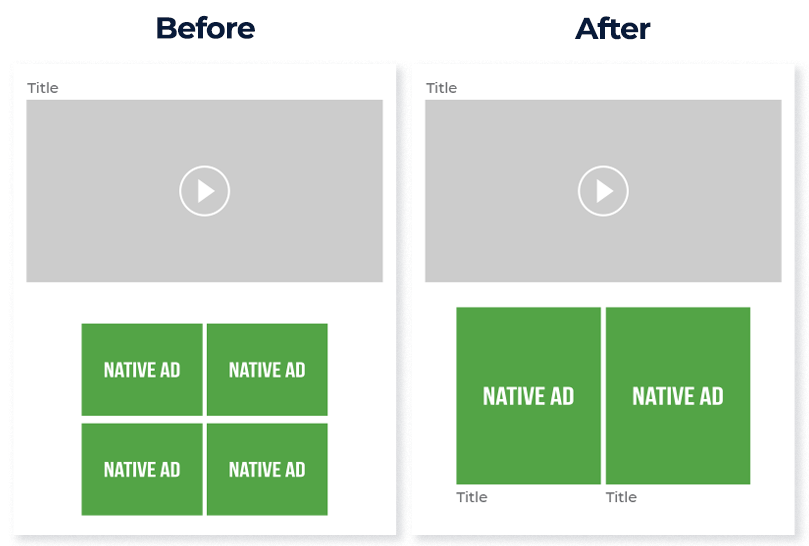
On the mobile version of my site, originally I was using the 2×2 widget. The images were small and squashed close together. My account manager recommended that I try the 2×1 widget to see if that had a positive change on revenues and to also add in a title text the same font size and color of my site. I enlarged the Native images so that they filled the full screen of the mobile device to make the Native ad zones really stand out. This worked much better on mobile for user experience because the end user scrolls down through the content and the Native ad zones look like highlighted content when compared to the previous four small images I was using. This had a positive effect on both CTR and CPM.
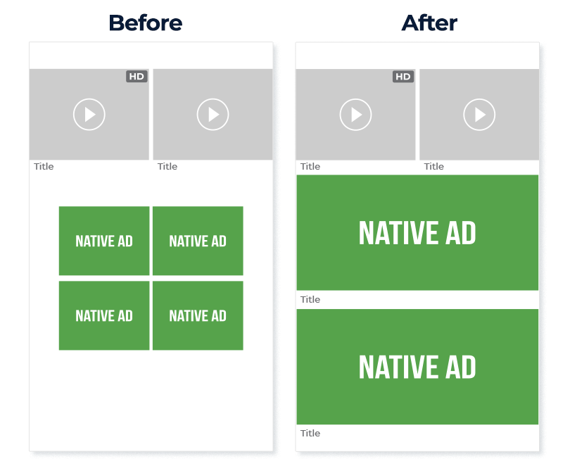
On Desktop I was using a 2×2 widget. Because of user experience on desktop I always labeled the section as an ‘Advertisement’ and originally I didn’t include a title and the images were slightly smaller than the content thumbnails on the site. So I changed the thumbnails to the same size as my video thumbnails and added in a title in the same font and colour as the rest of my site. This saw a smaller increase compared to the mobile version, but was still very positive.
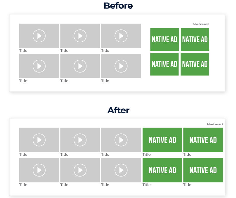
Here is an overview of how I saw improvements after 10 days of implementing the way I showed my Native ads on mobile and desktop:

Case study 2
Our next case study goes into more detail looking at how the change affected revenues, CPMs and CTRs across 10 GEOs.
The majority of my traffic is for the mobile version of my site. I was using the 2×1 widget for mobile. I just used the default size and didn’t enable the zones to display the title or description. My account manager recommended that I optimize the zone to make it appear the same size as the video thumbnails and activate titles and descriptions, she also recommended that I show the HD red box and then adapt this to AD so the end user was aware somewhat that it was an ad.
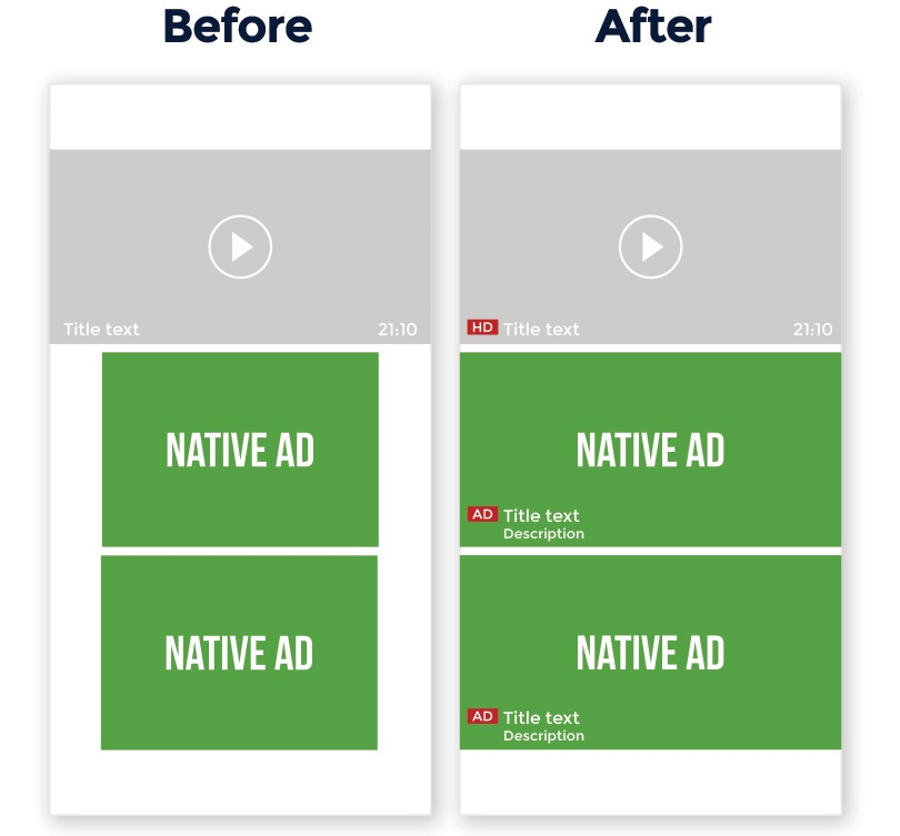
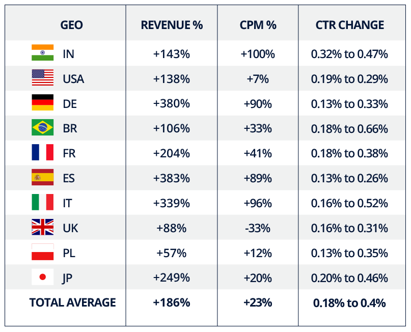
10 days after the new implementation I compared results across 10 GEOs and saw some pretty big percentage increases in revenues and my CPM value. Not only that but all the CTRs increased which ensures that the Native ad spot is not only more valuable to me, but also to advertisers who are bidding on my mobile site’s Native ad zones. Here is an overview on mobile. In some GEOs like Germany, Spain and Italy my revenues increased by over 300%. In India my CPM increased by 100% and the biggest CTR increase was Brazil. Here is an overview on mobile of the results:
Having seen how that improved my mobile revenues I decided to see if I could boost my desktop traffic and see if this increased revenues. I was using a Native footer widget 1×5 placed right at the bottom of the desktop page. The content was separated from the footer by a Show More Videos button and no titles or descriptions were showing, and the 5 images within the widget appear squashed and displayed portrait instead of landscape like the rest of the content on my site. My account manager recommended switching to a 1×4 widget as my video content also displayed as 4 in a row. Then to move the Show More Videos button below the footer. This way the Native ad zones are less likely to get skipped by the user before clicking the button. I enabled title and description. I already displayed HD on the videos in grey on desktop, so again I enabled AD in its place on the Native ads.
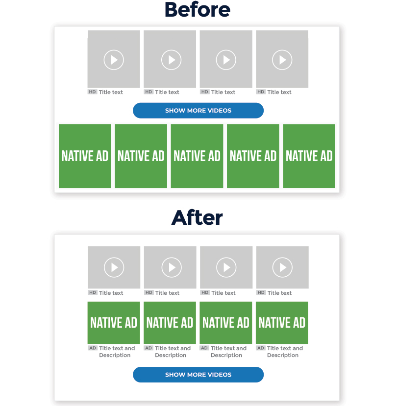
From previously having a very small revenues on desktop for the Native ad zone, I bought some referral traffic for my desktop site, this small investment not only boosted my revenues by 57% for the Native ad zone it also increased my CPM by 200% and gave advertisers a much better CTR from 0.03% to 0.24%. As a business strategy I will definitely invest in more referral traffic as the return is well worth it.

Case study 3
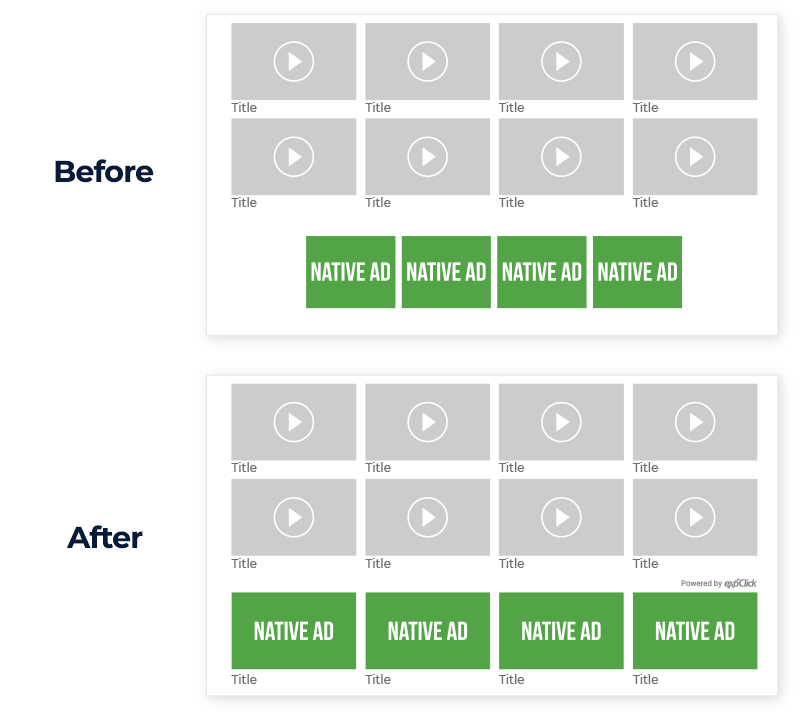
For the desktop version of my website I was using the 1×4 widget in the footer. My account manager suggested that I change the Native widgets images because they were much smaller than the video thumbnails on my site. I was already showing the titles. So I changed the thumbnails to be the correct size. I also showed the Powered by ExoClick text as I want to ensure a good user experience and that they know they are ads.
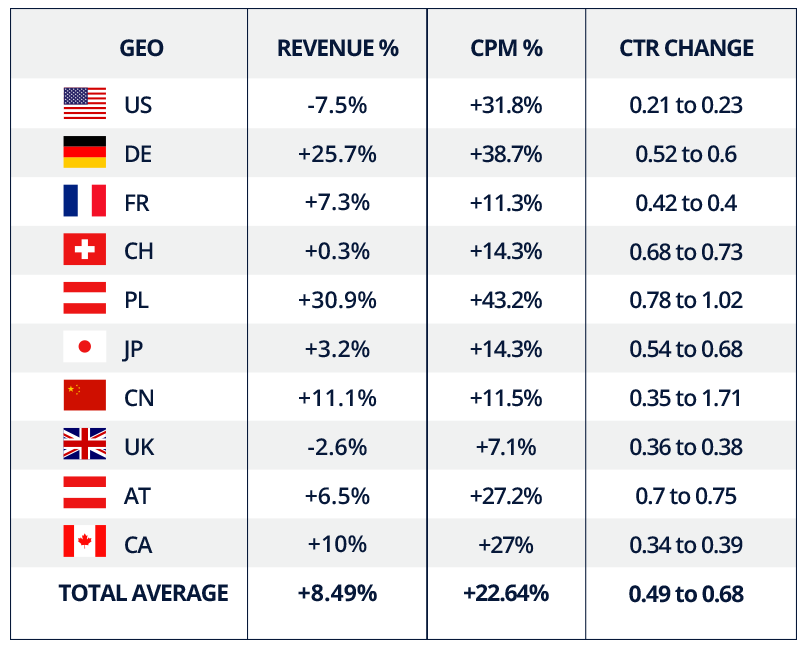
Overall I am happy with the results. Revenues increased across my top 10 GEOs, except a slight drop in US & UK, but this improved positively a couple of days afterwards and all GEOs showed a marked improvement in the CPM value of my Native ad zone and the CTR went up across the board. Here is an overview on desktop:
On the mobile version of my site I was showing the 2×2 Native widget as an under video player. The images were in landscape and smaller than the mobile site’s content thumbnails and I was showing no title. My account manager recommended that I change to a 1×2 widget and make the images larger, because end users browse the mobile version with a vertical scroll, it was suggested that I show these images in portrait mode, which allowed me to make them slightly bigger under the main video content thumbnail. I also showed the title.
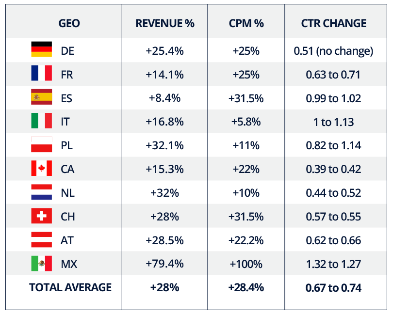
Here I saw a bigger increase in revenue at 28% overall. I was also getting a higher global CTR increase which went from 0.67% to 0.74%, compared to desktop where it was 0.49% to 0.68%, which is still a big increase. In Mexico my CPM went up a huge 100%. In fact a global average of 28.4% on mobile and 22.64% on desktop was a pretty good increase. Here are the results from my top 10 GEOs on mobile:
7 Optimization Tips
All of these publishers saw positive results with the changes they made, each one tried a different strategy. Here are some further tips:
Tip 1: ExoClick’s Native widget is fully customizable and you can make it look exactly like it is part of your content. If the Native ads look like the content the CTR will be high, although it may affect user experience. But if you want to make it similar to the content, but highlight that it is an ad to your end users you can add the “Powered by Exoclick” option so it’s clear that it’s an ad.
Tip 2: Experiment with the widget size, sometimes less is more, so by reducing the widget size, for example 1×5 to 1×4, this makes your Native ad zones more competitive because having having less positions/spots will increase the chances to get the ad clicked on as the end user has a more focused choice of images to click on which can push up your CPMs
Tip 3: Always add in at least a title text, this gives advertisers more chances to convert as the image has a call to action, which will bring you more advertisers for your Native zones. And if your video content thumbnails feature a title and description, also add in the description for your Native ads so that the ads feel more like your content. Finally, also make sure that the font is the same size and colour of the thumbnail texts on your site to help the ads fit in.
Tip 4: It’s very important that you display the Native zone in a different way when showing it on desktop and mobile versions of your website. As you saw in the case studies, all publishers used different strategies for desktop and mobile. Mobile is a different user experience to desktop therefore smaller widget sizes are better and as users scroll vertically use 1×1, 2×1, 2×2 widgets. For desktop good ideas are 1×1 within the content thumbnails or rows of 1×4, 1×5, etc depending on how many thumbnails your site has per row on screen. So we recommend that you create separate zones for each device. And test them to see which ones bring the most revenues and CPM and CTR increases. Most advertisers bid on CPC, so we recommend creating widgets in the best possible location with only a few positions. The more positions a widget has, the lower the CTR will be and therefore the CPM. Experiment with the positioning of the widget!
Tip 5: Visibility is key to having good CPM and revenues, so we recommend placing the Native ads above the fold or mid fold of your site, for example NTVs, under the player, In- Content. As in the case study 2 example, the widget is a footer, but by placing it above the Show More Videos button this really helped with a more lucrative Native ad zone for the publisher.
Tip 6: If you’re going to use the Native ad zone as a fallback for a Banner ad zone, please make sure you create a different Native zone for each different Banner position, instead of using the same fallback zone on all the positions. For example, if you want a Native fallback for your NTV Banners, create a Native fallback for each different position, one for NTVA, another one for NTVB, etc. This will improve the CPMs and revenues you obtain from each fallback.
Tip 7: Always check to see if the changes increase your CTRs as the higher the CTR the more valuable your ad zone is to advertisers.