Desktop publisher case study: How to increase ad revenue with Direct Links
Wondering how to increase ad revenue? Direct Link ads are a great way to convert advertiser offers, because they are designed to attract the attention of end users who are actively browsing for content. These end users are very likely to click and generate conversions, making your ad zones more competitive – Which translates into higher revenues for you! Direct Links are a very versatile format which has many variations, so when thinking of placement, it is important to take into account a few factors:
#1 The difference between mobile and desktop, when it comes to placement and messaging style
#2 Where in the page it is better to place your Direct Link ad zone
#3 The difference between using emojis or just plain text
#4 How the number of objects around the Direct Link makes a difference
#5 How to avoid unintended clicks that would affect CTRs and conversions negatively
On today’s desktop publisher case study we will look at two publishers that did small strategic placement and messaging changes that had a noticeable positive impact on their ad clicks and revenues. Let’s get into it!
How to increase ad revenue: Ad zone recommendations for desktop devices
According to Oberlo, as of February 2023, 47.92% of the total web visits in the US were currently coming from desktop users, compared to 52.08%, which were coming from mobile. Although the mobile format has rapidly claimed its n.1 position when it comes to popularity, there is still a huge percentage of online users in Tier 1 countries that rely on the desktop format to browse your website’s content – Remember: The highest eCPMs can be reached by targeting Tier 1 GEOs, so it is a good idea to pay attention to how your Direct Links display on desktop devices!
Most modern monitor screen sizes range from less than 21 inches, to well over 30, making desktop a wide and extremely flexible format when it comes to ad positioning and CTA character count. This opens up a lot of possibilities for your Direct Link ad zones, also taking into account the variety of Direct Link placements that you can use (In-Player Text Link, Sticky Banner, Button, Widget, Menu Tab, etc.). Then, in terms of how to increase ad revenue and how to optimize Direct Link ads on desktop, the best approach is to test out various placements across the website, as well as messaging approaches, which is exactly what the next two publishers did:
Desktop publisher case study 1: Contextual messaging and emoji combo
On the first desktop publisher case study, this publisher enabled a Menu Tab zone for the Gaming vertical on his Gambling website’s navigation menu, so that his advertisers could promote their Games offers. Although the Menu Tab was doing relatively well, the publisher was wondering how to increase ad revenue, so he asked his account manager for advice. We looked into it and found out that:
- The CTA text ‘Check out our partners!’ was quite general and didn’t even refer to Gaming, so the end user wouldn’t know what was to be found through the Tab.
- The wording was also not very strong nor eye-catching, and most likely didn’t spark the end user’s curiosity.
- Lastly, the character count was also quite long, which could contribute to the end user’s loss of interest before even thinking about the possibility of clicking the ad!
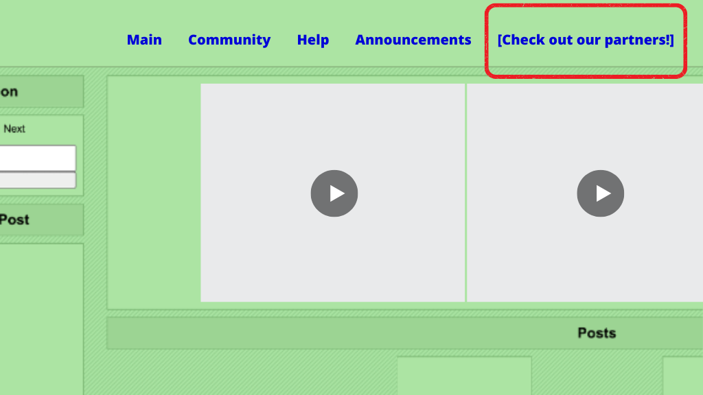
The publisher’s account manager advised them to change the wording from ‘Check out our partners!’ to ‘Games!🎮’:
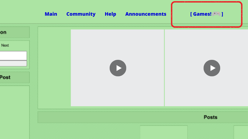
An important point to consider when adding a Direct Link ad, is that websites on desktop devices tend to show a fair amount of elements, whilst their mobile version tends to be more simplified to fit the smaller screens. Therefore, it is important to make your ad zones stand out amongst the rest of the content when targeting desktop users:
- Now, after the change, the CTA clearly states what the end user can find if they click the Tab, which not only captures their attention, but also avoids poor quality clicks that would result in lower CTRs and conversions.
- The text is as short as it gets, with one single word, making it stand out and avoiding for the end user to become uninterested and just keep scrolling.
- The 🎮 emoji reinforces the messaging, making it pop amongst the rest of the tabs from minute 0, and making it clear what this Tab is for even before the end user has had the chance to read the word ‘Games’.
- Also, emojis are international, so even if an end user doesn’t speak English, they know exactly what they will find at the other end of the click.
Here are the results achieved by this publisher after implementing this small strategic change:
#1 +41% click increase! Clicks went from an average of 1,770 per day to 2,500 per day, the week after the change (+41%)
#2 +140% revenue increase! The daily revenue generated by this ad zone increased by +140% on the week after the change.
So, as we can see, a small change goes a long way!
Now, let’s look at the second publisher:
Desktop publisher case study 2: One small change for your ad placement, one giant change for your ad revenues!
The publisher of our second desktop publisher case study had positioned his Direct Link as a Menu Tab at the navigation bar, at the very top left of his VoD website. The font was remarkably small, and the visibility very low. So, especially on desktop devices, it did get completely lost amongst the rest of highly visually compelling elements that made up the website. To maximize his Direct Link’s results, we advised him to place it in an undervideo position, as a Button ad.
Here’s what it looked like before, as a Menu Tab:
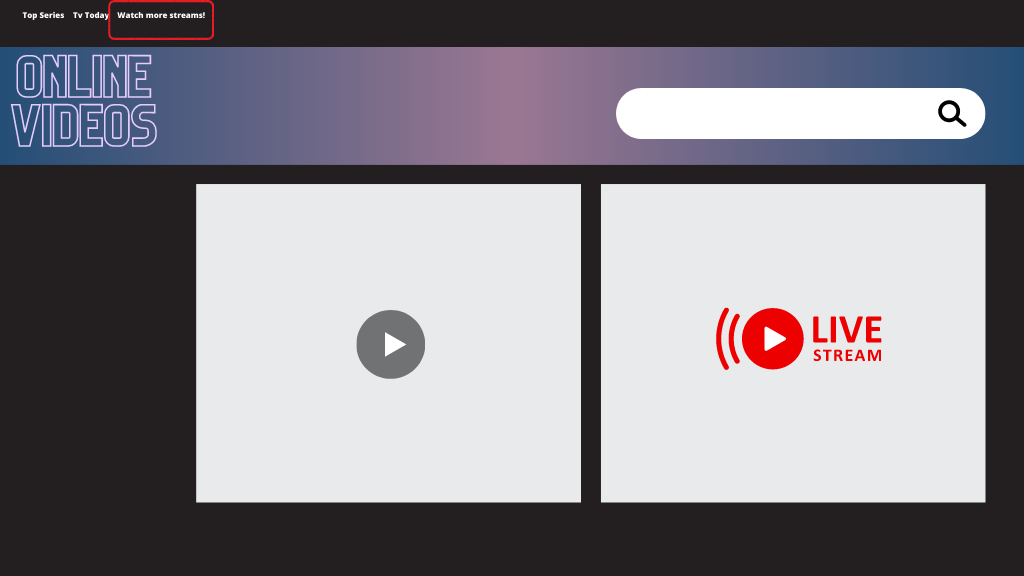
The main reason behind such a small navigation menu is that this is a video based site where the end user is meant to scroll through the page’s content, or directly search what they are looking for through the search feature at the right side of the website name. This website, which has been optimized for wider desktop screens, features large videos and images, which means that the Menu Tab as it was positioned initially, was at risk of becoming completely invisible – Even if the end user was interested in the content that this ad offered, or was even directly looking for it, most likely they wouldn’t even know that it was there!
So here’s what it looks like now, after changing it to a Button ad, under a popular video:
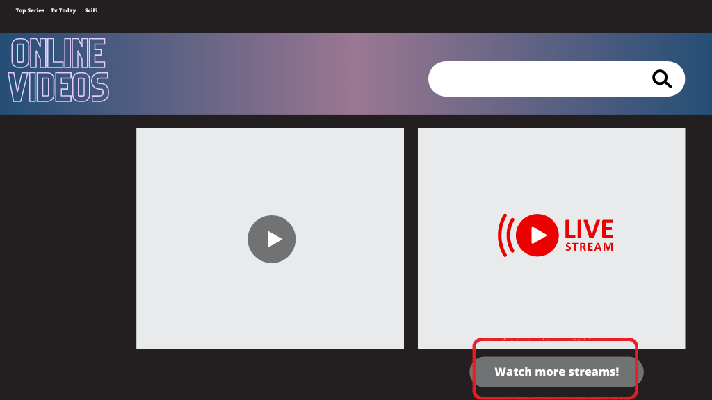
- Because the Direct Link has been placed under a popular piece of content, more end users are likely to see it – Now, it won’t be lost amongst the website’s content. Instead, it is using the content’s popularity to its advantage!
- Also, because generally end users spend more time watching a video than other pieces of content, they have more time to become aware that the Button is there.
- And lastly, because the message ‘Watch more streams!’ is relevant to the video right above the Button, end users that gravitate towards this piece of content will most likely be interested in clicking the ad and converting.
Here are the results achieved by this publisher after implementing the changes:
#1 +173% click increase! Clicks went from avg. 540 per day to 1475 per day during the week after the change (+173%).
#2 +275% revenue increase! As a result of this, daily revenue generated by this ad zone increased by +275%, a week after the change.
So, once again, a relatively small change (from a Menu Tab at the very top of the webpage, to a Button right below a video) triggered great results.
Now, let’s look at some expert tips from our account managers on how to optimize Direct Link ads on desktop devices:
How to increase ad revenue on desktop: Expert tips!
Tip! Test out different Direct Link placements: Direct Links are an extremely versatile format, and so it is the desktop website view. You can use different placements on various locations across the wide desktop screens, such as an In-Player Text Link, a Sticky Banner, a Button above or under a video, a Widget amongst content, Submenus in the navigation bar, etc. Test out a few different placements and see what works best for your website!
Tip! Test out different verticals: There are a few verticals that you can test out for your Direct Link, including Casino, VoD, eCommerce, Live Streaming, Dating and Games. It is advisable to run tests for a few weeks to determine which Direct Link ads your website users are clicking the most, as this will provide insights into their preferences for specific verticals. If you notice a particular vertical experiencing a downward click trend over time, it may be time to switch to another vertical to keep your Direct Links fresh and optimize end user experience and ad revenue.
Tip! Make sure the verticals are relevant: Following up on the previous point, this is key when wondering how to increase ad revenue with your Direct Link. Make sure that your chosen verticals are relevant to your site’s content. For instance, if you have a Gaming site, you could enable VoD to target end users who play video games that also enjoy series and video content in general, as well as Casino and Gambling Direct Links.
Tip! Experiment with messaging: Different CTA messages work for different audiences, and desktop allows for both longer and shorter character counts, so test out different approaches. For instance, your ‘eCommerce’ Direct Link could also be called ‘Buy your date a present!’, if you have a Dating website, especially if it is Valentine’s Day! Your VoD Direct Link could be called either ‘VoD’ or ‘Watch Videos!’ or ‘Video Zone!’, and so on. Test them out and see what your audience reacts to best. Still, remember that excessively long messaging might be annoying for the end user, so try and keep your messaging concise and to the point.
Tip! Different placements require different CTAs: Related to the point made above, different Direct Link placement types will work best for different copywriting techniques. For instance, a Button could have a more direct approach, such as ‘Watch our videos!’, or ‘Play our Games!’. This could be similar to an In-Video Text Link, although it could be slightly longer, ‘Watch the best fun videos now!’. When it comes to Menu Tabs, the shorter and more concise, the better, ‘Fun Games!’.
Tip! Use emojis: Emojis are great to create a visual impact that will enhance the message on your Direct Link. Also, they are international, which means that you can use them to appeal end users worldwide, no matter their language! For instance, Live Streaming or Video could be followed by 📹 (or even be entirely replaced by the emoji!), Dating, by 💌, and so on.
Do you have any more questions about how to increase ad revenue using Direct Links or want to enable this format on your website? Need more tips to monetize your desktop traffic, or have any extra questions about this desktop publisher case study? Make sure to speak to your account manager or to a Customer Success Manager here!