Publishers! 5 successful Outstream ad zone implementations

The Outstream video ad format is a game changer for publishers because it allows you the freedom to put video ads on your site wherever you want, and where you place your Outstream ad zone can have different effects on revenues and impressions. We looked at 5 publisher sites (2 on desktop, 2 on mobile and 1 on tablet) who implemented 1 Outstream ad zone. We examined the effect on revenues and impressions for each site’s top 10 GEOs from 1 February to 1 March 2021.
Image only content sites
Desktop site

This site is a gallery site hosting only images. The Outstream ad is displayed once a user clicks on an image thumbnail, taking the user to a page dedicated to that image. After scrolling down past the image, the Outstream ad is revealed to the end user.

The container size is customized at 800×473 and the ‘Ads by ExoClick’ option is used by the publisher to obtain quality clicks. Now lets look at revenues and impressions:
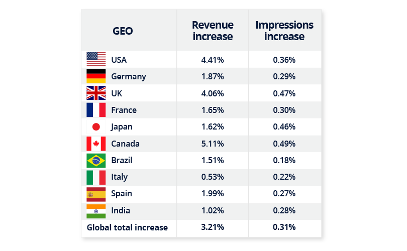
For this publisher the top 3 revenue increases were Canada, USA & UK with a global revenue increase of 3.21% on the website’s ad revenues and a global increase of 0.31% impressions.
Mobile site
This site is the mobile version of a popular Image only site and features no video content, so this was the first time the publisher could use video advertising on the website.

The Outstream ad zone is placed within the content thumbnails, with a custom container size of 426×252 chosen which is full screen width on mobile, and ‘Ads by ExoClick’ is displayed. Revenue increase is impressive:
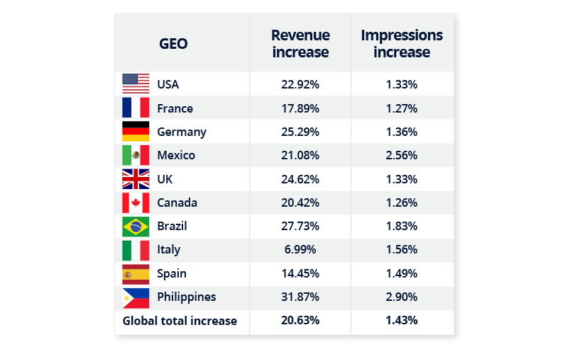
This publisher saw a very large increase in revenues from implementing Outstream. This site has huge volumes of traffic on mobile devices, using Outstream video really makes the ad stand out against the image thumbnails. By displaying the Outstream ad zone amongst the content thumbnails, where users select which story they want to read, makes the ad part of the user journey. This strategy gained the publisher a global revenue increase of 20.63% and 1.43% increase in impressions with the top 3 revenue increases in the Philippines, Brazil and Germany.
💡TIP! If you are showing an Outstream ad to an end user every time he clicks on an image thumbnail, we recommend that you use frequency capping, if the same ad zone is shown repeatedly to the user many times during a session, it will affect the CTR creating ‘banner blindness.’
Video content sites
Desktop site
This site displays video content as thumbnails in rows of 5 on each webpage page. The Outstream ad is placed on every page, but below the fold, so as the user scrolls down a page the video ad is displayed.
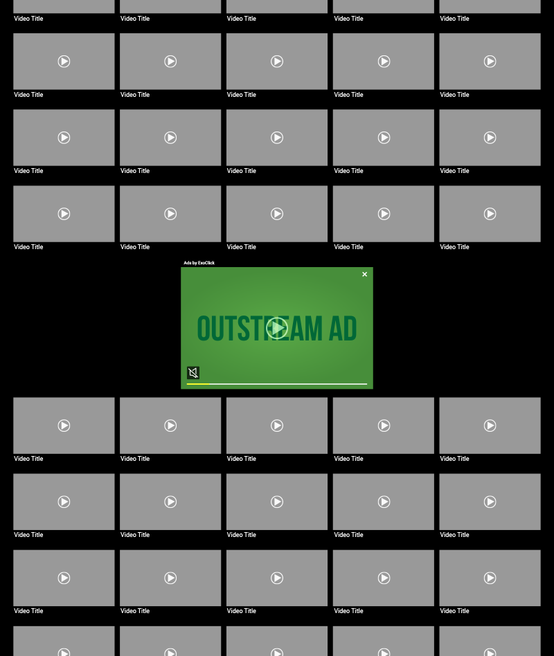
The size of container used is 440×272, which is about double the size of a thumbnail on the website. Because of its size, the ad stands out to the end user, the ‘Ads by ExoClick’ option is used by the publisher to obtain quality clicks. Let’s look at revenues and impressions:
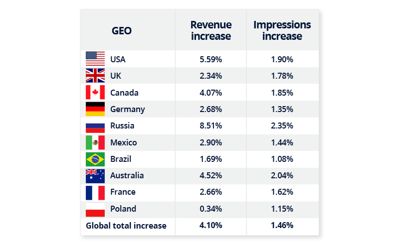
By implementing the Outstream ad zone below the fold was a great strategy for this publisher, not only does it provide a great user experience but revenues were up globally by an additional 4.1% while impressions were up 1.46%, top 3 GEO revenue increases were Russia, Australia and Canada.
Mobile site
This mobile version shows the site’s video content as thumbnails, each thumbnail is just smaller than the screen width of a mobile device. As the user scrolls through the thumbnails the Outstream ad zone is displayed halfway down the page.

The publisher did not implement the Ads by ExoClick, but he did use a customized container width of 430×241. This is a few pixels wider than the video content thumbnails, to make it stand out as an ad. Let’s check out the revneues and impressions:
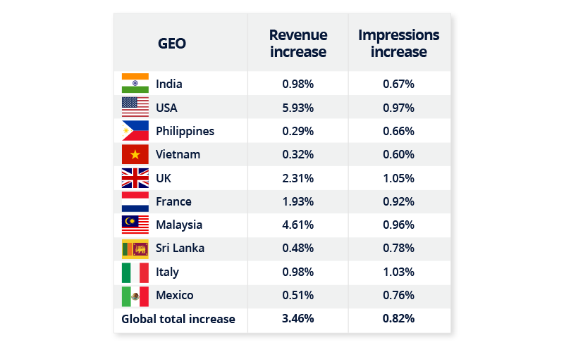
This publisher saw a rise of 3.46% globally in revenues and 0.82% in impressions, with top 3 GEOs for revenues USA, Malaysia and UK.
Tablet site
On the tablet version of this site the ad zone appears after the 3rd row of thumnails (vertical) and after the 2nd row of thumbnails (horizontal.)
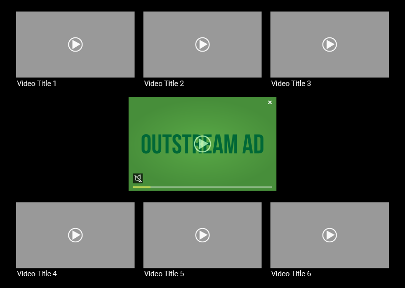
The publisher did not use ‘Ads by ExoClick’ and custom size is set at 42% of the screen width. Let’s look at revenues and impressions:
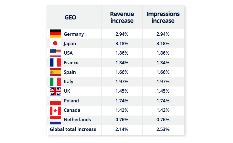
This publisher saw a global revenue increase of 2.14% and a similar impressions increase of 2.53%. In our previous case studies we saw a much higher revenue ratio compared to impressions.
Our recommendation to this publisher is to place the ad zone much further down the site, around the middle of the scroll and add ‘Ads by ExoClick.’ This will ensure that the ad zone is part of the user journey because the end user will have browsed some of the content before seeing the Outstream ad. End users will know it is an ad, so any clicks will be of high quality. High quality clicks are gold to advertisers with higher bids being paid for quality ad zones, this will increase CPMs, earning the publisher higher revenues for less impressions.
💡TIP! Don’t make the Outstream ad the same size as your thumbnails, this can be misleading, end users might click not knowing it is an ad, which creates a bad user experience and also the quality of the clicks will be low.
Conclusion
In these examples 1 ad zone was used per page and increased the site revenue between 2% and 20%, but how many Outstream zones should you use on a site? You can set up as many Outstream ad zones as you like, however the key here is to test and find the sweet spot by providing the right balance between quality and quantity for the best user experience, views and CTR for advertisers.
Please read our Outstream Video Publisher Dos & Don’ts for the best implementation advice or watch our video tutorial Effective Outstream Video Zones for Publishers