Publishers! How to make Multi-Format Ads match your content
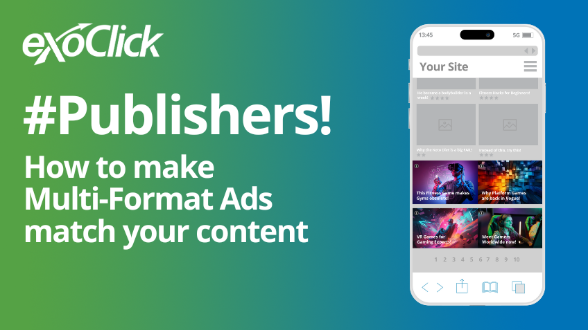
Are you wondering ‘how to make Multi-Format Ads match my content’? Multi-Format Ads allow Publishers to serve multiple formats on each single Banner and Native ad placement on their website, pitching different Banner sizes and Native ad widgets against each other and serving the highest paying ad per Multi-Format zone. This is great both for you as a Publisher, and also for your Advertisers, because it means that you can increase the number of bids for your impressions while giving Advertisers access to previously unavailable inventory, and avoiding the ‘one size fits all’ approach to Advertising. So, ‘how to achieve a seamless look and feel with Multi-Format Ads?’ Multi-Format Ads are fully responsive and open more zone and placement options including Native, which can be customized. This means that you can tailor them to your website’s look and feel, providing a seamless, pleasant and non-obtrusive experience for your end users.
How to boost my website revenues with Multi-Format Ads
How to boost my website revenues with Multi-Format Ads? Implementing Multi-Format Ads on your website is easy and you can select different Banner sizes and Native widgets by generating a single ad script. You can set up ad zones to compete against each other, showing only the one with the highest CPM value. This allows you to convert several ad zones into Multi-Format zones in your admin panel by using combinations of horizontal or vertical options, making your Multi-Format zones responsive for all devices (Mobile, Desktop and Tablet).
So for example, for a typical large display Banner zone, the Advertiser can’t target it with a smaller ad creative, however if you use the footer as a Multi-Format Ad zone, this opens up new inventory for an Advertiser that wasn’t previously available. With Multi-Format Ads, the Footer now has different combinations of inventory depending on which won the highest bid for either the whole Footer zone, or parts of the Footer zone. Below are a few possible Multi-Format combinations that you can test out:
- NTV (Next to Video) ( 300×500)
- Native 1×2 vertical
- Native 2×3
- 900×250 Banner + 4/3 300×250 Banner + 4×1 Native
- Mobile Header Banner 300×100 + Native 2×1 text over image
- Mobile 300×250 (Middle or Footer) Banner 300×250 + Native 2×2 text over image + Native 1×2 text on the side
Multi-Format Ads are responsive and enable creatives to adapt size and layout to display their best, avoiding glitches and boosting results. Take for example this Publisher, who managed to increase eCPMs by +48.7% and revenues by +215.6% upon enabling swapping his banner only ad zone by a Multi-Format Ad placement using a Native widget 1×3 competing with 3x 300×250 Banners and 1 x 900×250 Banner.
How to make Multi-Format Ads match my content
If you are wondering ‘how to achieve a seamless look and feel with Multi-Format Ads’, Multi-Format Ads can be one of your best tools as a Publisher to achieve a cohesive and pleasant browsing experience on your website; they never usually have strict dimensions. Instead there is maximum and minimum width and height which can be occupied, offering further flexibility for the ads to fit in perfectly within their placement or widget. This will make it more likely for end users to click and convert, increasing your eCPMs by bringing greater value to your ad zones for Advertisers.
Also, by editing your Native zone’s CSS code, you can further customize your Native Multi-Format zones. You can for instance edit what is displayed inside the ad zone e.g. Text Titles & Description font, size and color to match your site, images displayed the same size as your thumbnails or as a ratio that looks good against the rest of the content on your site.
Continuing on we will see some Multi-Format Desktop and Mobile zones that have strategically placed and customized to fit the website’s look and feel:
Publisher 1: How to make Multi-Format Ads match my content on Desktop
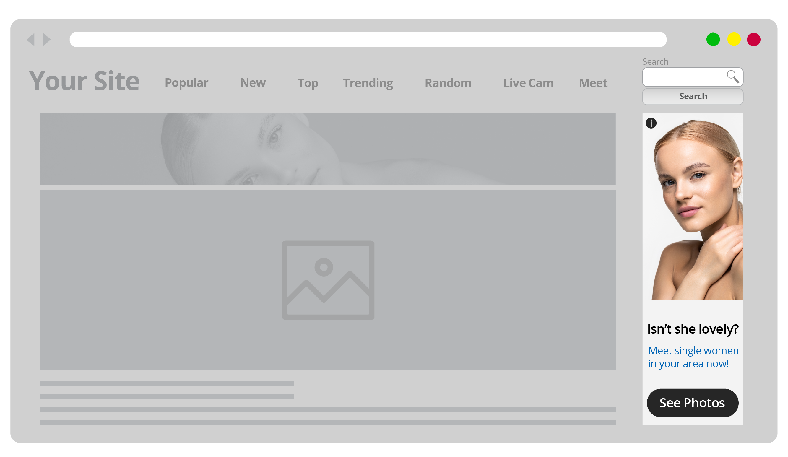
Wondering what are the best Desktop Multi-Format Ad zone combos? This Publisher decided to combine a Multi-Format NTV 1×2 and three single In-Content Desktop Native 300×250 widgets zones on the Desktop version of his website to fully integrate his ad zones with the rest of the content:
Three single In-Content Desktop Banner zones (300×250): a great way to improve user experience with Multi-Format Ads, Publisher 1 placed three Multi-Format In-Content Banner ad zones which perfectly fit with the rows of content in his website. In-Content Banner ads are designed to fully merge with the website’s content and are designed to perfectly merge with the content around them. Because the zones are Multi-Format, the Banner placements are competing against 3 2×2 Native widgets, which, if they win, they will take the exact dimensions and disposition as the content grids surrounding them:
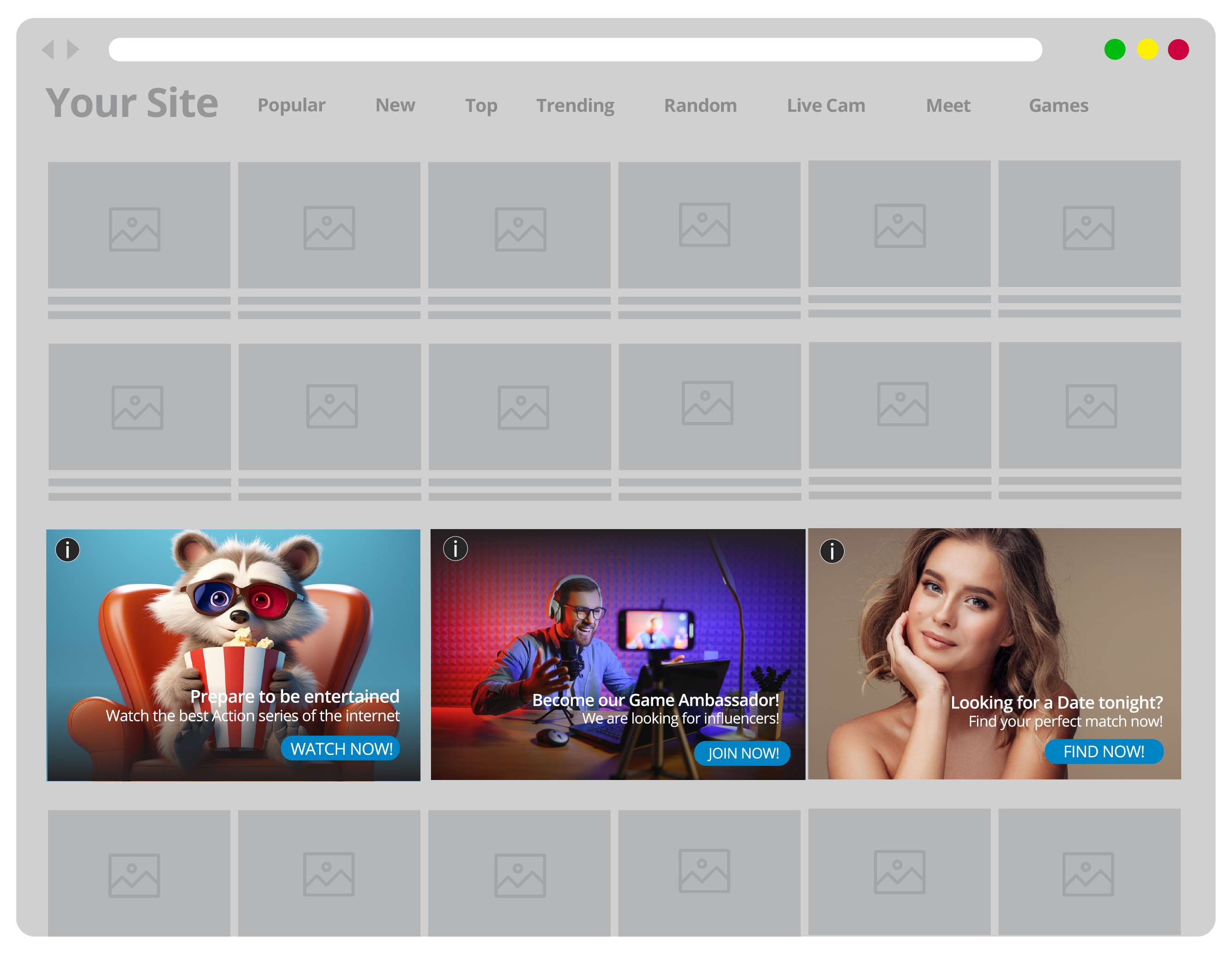
Multi-Format NTV 1×2 Desktop: this Multi-Format 1×2 NTV Desktop zone has been strategically placed on the right side of a main piece of video content, to create the impression that the two widgets are videos within the same playlist as the main video, YouTube style. Because Multi-Format Ads are responsive, the ads fit perfectly and appear well-centered with the main video content on the left, all optimized for Desktop view.
Publisher 2: How to achieve a seamless look and feel with Multi-Format Ads combos on Desktop
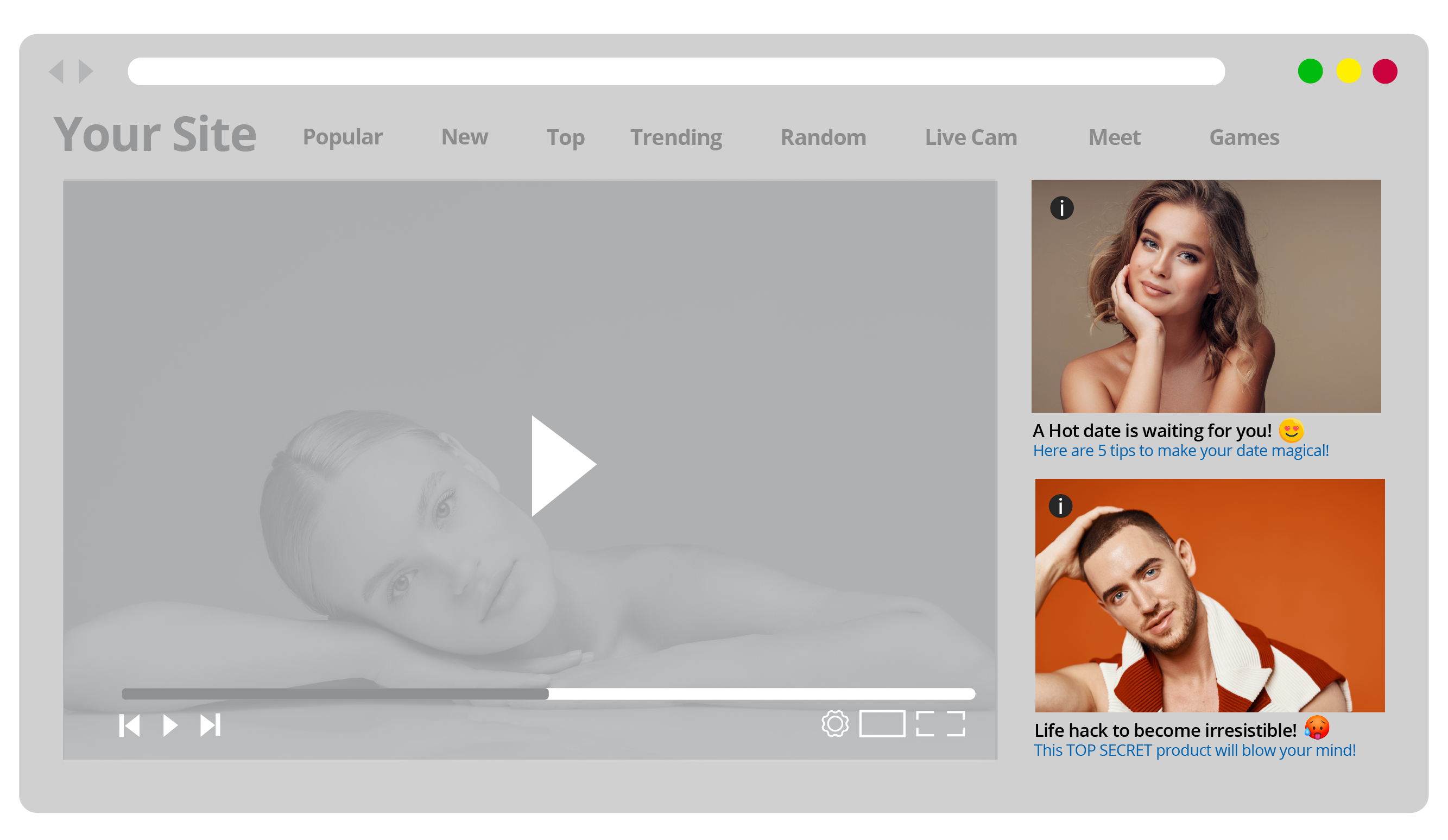
The second Publisher combined a 4×1 Multi-Format Footer Native zone with 160×600 Multi-Format SkyScraper Banner on his Desktop zones for his website.
4×1 Multi-Format Footer Native zone on Desktop: this Footer Native widget works very well with its environment because the Publisher tweaked the CSS code to customize the container’s layout, size and text to fit with the rest of the page’s content. Because Native ads work best when crafted in editorial style, this works especially well if you as a Publisher enable verticals that are related to your website’s focus topic to be targeted on your zones. Advertisers can then offer Tips or Hacks based content or even offers that match your end users’ interests, creating an all-encompassing experience, enticing them to click!
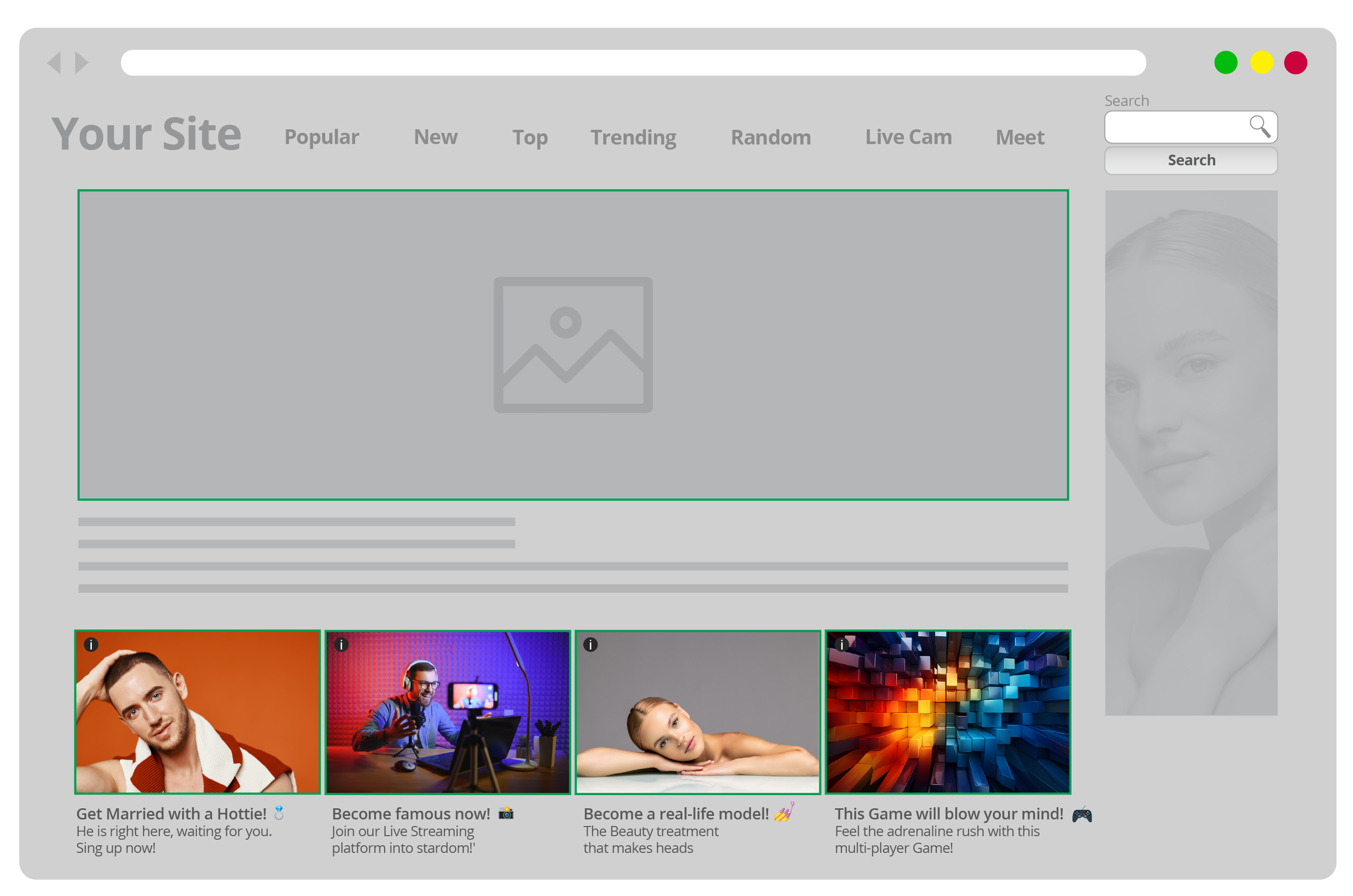
160×600 Multi-Format SkyScraper Banner zone on Desktop: this Publisher also enabled a Multi-Format SkyScraper Banner Desktop zone on his website which perfectly frames the main piece of content in the center, and fits well below the search bar on top of it. It also integrates well with the other Banner placement right on top of the central piece of content, without interfering with the navigation experience, yet standing out and catching the end user’s eye with compelling text and visuals. Because it is non-obtrusive, it enables the Publisher to provide the best possible end user experience, boosting their Google rankings and traffic flow.
Publisher 3: How to make Multi-Format Ads match my content on Mobile
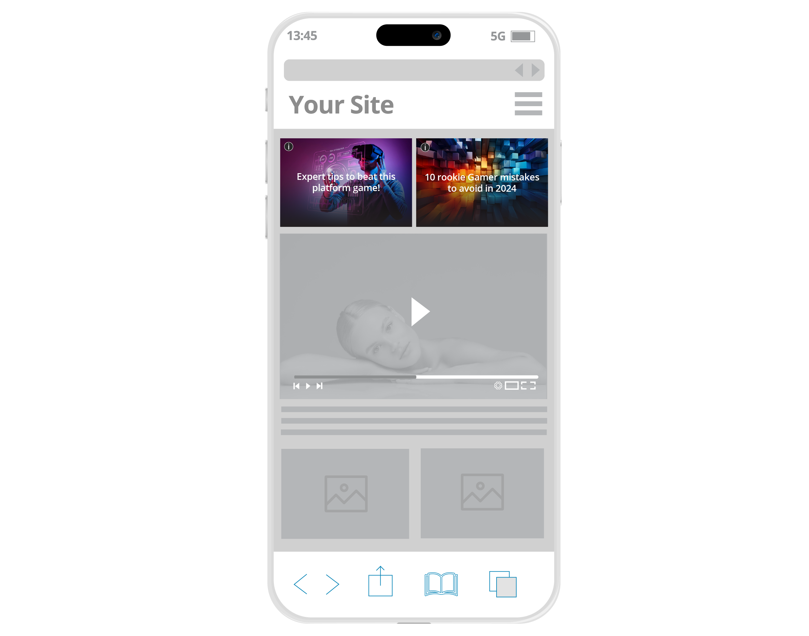
And now onto some of the best mobile Multi-Format Ad zone combos. The third Publisher combined a Multi-Format Ad Header Native 2×1 zone with a Native 2×1 Mobile Footer zone for his website, which is a great way to improve user experience with Multi-Format Ads:
Header Native 2×1 Mobile Header: in this Multi-Format Ad Header Native 2×1 placement, the Native widget fits perfectly within its environment, centered with the video below it and with the search bar above it, perfectly integrated within the website. To further make it match the look and feel of the site, the Publisher tweaked the Native widget’s CSS code to have the ad text over the ad’s image, at the very center. This way, both ads in the widget look like queued videos, or even suggested content after the main video content box below.
Native 1×2 Mobile Footer: another Native 2×1 zone, this time it is placed on the Footer, once again customized to integrate the ad text over the image and look like a video description. The Publisher has also customized the widget’s measurements and made the ads look like TikTok videos or YouTube shorts. The text over the images has been also customized to have a title and a subtitle, in the style of the videos on these platforms, imitating content produced by well-known content creators and influencers. The text also has emojis on it to further capture younger audiences and to appeal to the emotion and curiosity of the end user.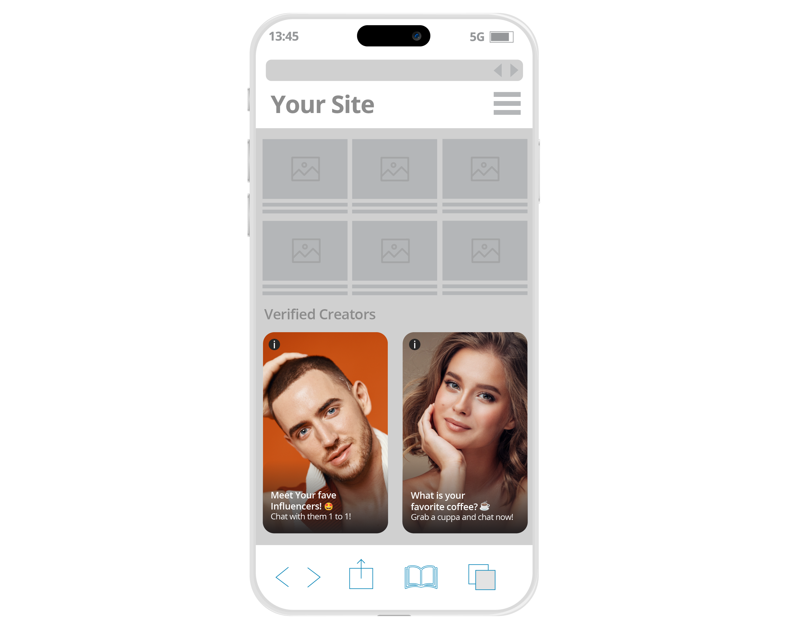
Publisher 4: How to boost my website revenues with Multi-Format Ads combos on Mobile
The fourth Publisher combined two Multi-Format zones: Mobile Footer Native 2×2 and In-Content Native, for his website:
Multi-Format Mobile Footer Native 2×2: the text on this occasion has been customized to match the exact font and style of the text titles of the video content right above it to make it look more like product videos or reviews on the website. The ad fully integrates with the end user journey and avoids ad blindness. Do you want more ideas on how to use CSS code to customize your Native widgets? Check out this article on the best 10 Native ad zone Custom CCS ideas for Publishers!
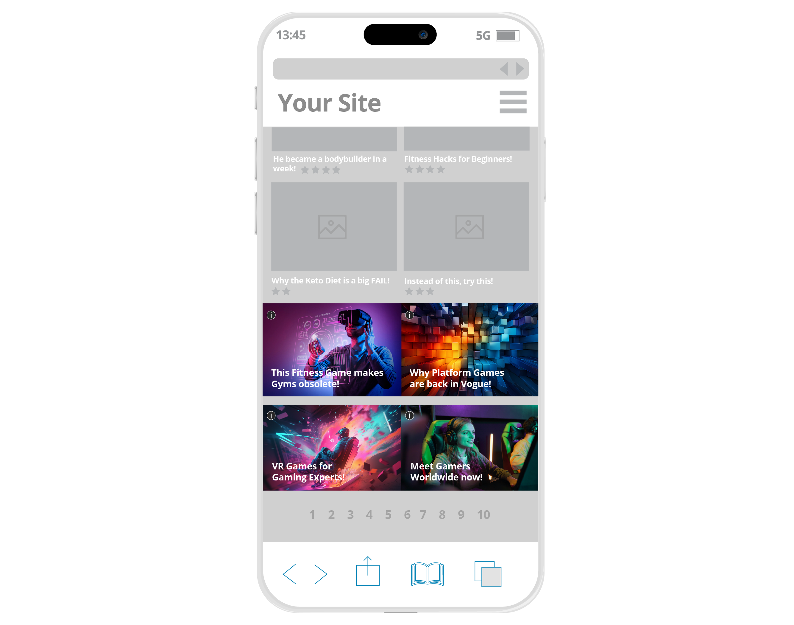
Multi-Format In-Content Mobile Native: another great example of an In-Content Native zone and how to achieve a seamless look and feel with Multi-Format Ads, this ad below does a great job in looking like the rest of the videos above and below it, making it more likely for end users to click through it and onto the Advertiser’s offer.
Still wanting more advice and tips on ‘How to make Multi-Format Ads match my content’? Get in touch with our Customer Success team NOW! To start testing out ExoClick’s Multi-Format Ad zones and noticeably increase your eCPMs and revenues!
Want to learn more?
Elevate your Online Advertising skills! Join ExoClick Academy, our free online learning hub. With concise video courses from Basic, Intermediate, and Expert designed for Publishers and Advertisers. You will learn how to maximize your knowledge and skills using ExoClick’s excellent platform features. Once you complete each course you will receive an official certificate of completion! Start your journey for online advertising success today! Sign up for free now!