Publisher Case Study: Creating Effective Native ads for a Multi-Format ad zone

In order to maximize your revenues from Native ads displayed within a Multi-Format ad zone, it is important that the ads displayed appear like the content on your site, or at least look good when displayed against your site’s content. This not only improves user experience but can generate more clicks which increases the value of your Native ad zone leading to higher CPMs and bigger revenues.
Many Publishers are using Native as part of a Multi-Format ad zone, which serves multiple ad formats: Banners or Native in just one placement, pitching the Banners and Native ads against each other and serving the highest paying ad in the Multi-Format ad zone. This ability to serve multiple formats can increase the number of eligible bids for your impressions while giving advertisers access to previously unavailable inventory.
The Multi-Format ad zone is fully responsive and changes shape to fit perfectly into a Publisher’s site, however, as with all Native ad placements, it is good practice to tweak them: Such as editing what is actually displayed inside the Native ad zone e.g. Text Titles & Description font, size and color to match your site, Native images displayed the same size as your thumbnails or as a ratio that looks good against the rest of the content on your site. Here we helped 3 Publishers create better Native ad zones for their Multi-Format ad zones and compared the results of before and after the change.
Case study Mobile Footer
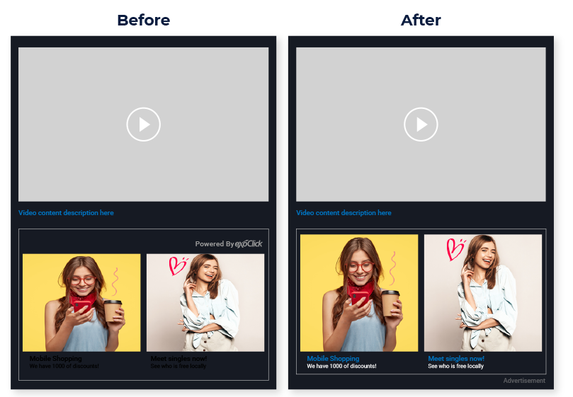
This publisher was displaying a Multi-Format ad zone as a 2×1 Mobile Footer.
The issues: The Publisher had the ‘Powered by ExoClick’ enabled which reduced the size of the space to display the Native images. Also, he was using the default settings for the colour and font of the texts, which is black. Because the website’s background colour theme is a dark blue the Native Title and Description were very difficult to read and looked bad to end users, which would result in less clicks.
The solutions: We advised the Publisher to disabled ‘Powered by ExoClick’ and add the word ‘Advertisement’ below the 2×1 Native widget, this ensured that the zone would get qualified clicks. He also changed the font colour, with the ad zone’s title text matching the same text colour of his site, and the zone’s description text in white to make it more eye-catching for users to click. Now the Native zone looked great with the rest of the site.

Results
30 days after implementing the changes the Publisher saw the following results:
- CTR no change at 0.22%
- eCPM +10.53%
- Revenue +5.08%
Case Study Mobile Middle
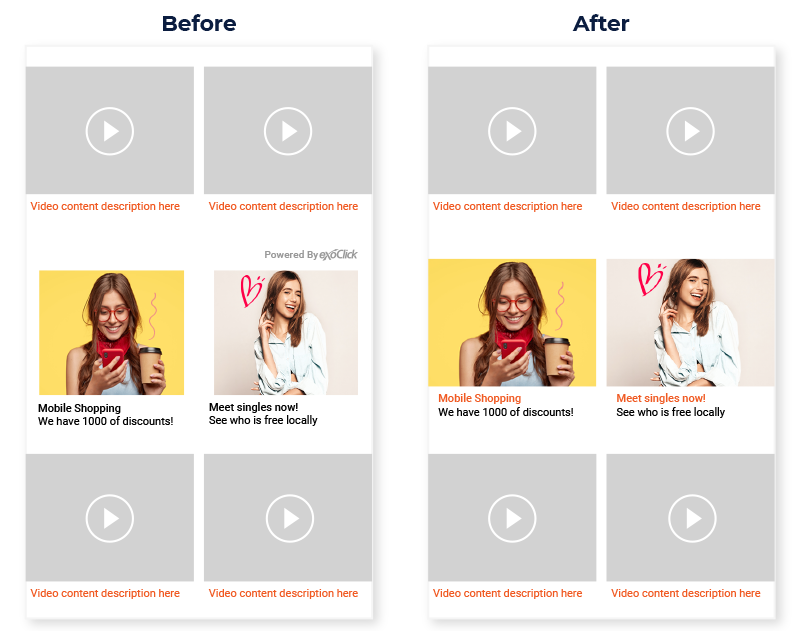
This publisher was displaying a Multi-Format ad zone as a 2×1 Mobile Middle
The issue: The Publisher had selected the default image size, default font colour and included the ‘Powered by ExoClick.’ As you can see in the image below, this made the images smaller than the site’s thumbnails, and the texts did not match the thumbnail descriptions on the site.
The solution: We advised the Publisher to remove ‘Powered by ExoClick’ and customise the image size and also to modify the container in which the zone was placed, as it had weight and height limits that didn’t make the zone look good. Additionally he changed the Native title font to orange to match the text colour of his video content descriptions. The description text was left in black to stand out to the end user, now the appearance of the Native zone is much better matched to the website’s video thumbnails.

Results
After 30 days of implementing the changes the Publisher saw the following results:
- CTR from 3.05% to 3.78% (+23.93% increase)
- eCPM +40%
- Revenue +74.37%
Case study 1×1 Desktop Index Cube
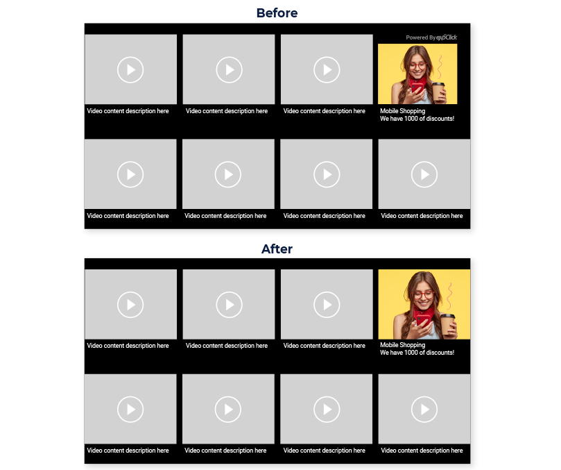
This publisher was displaying a Multi-Format ad zone as a 1×1 Desktop Index Cube.
The issues: The Publisher had the ‘Powered by ExoClick’ enabled which made the Native images look smaller than the rest of the site’s thumbnails. The publisher had previously matched the font to the video descriptions in white.
The solutions: This was a very quick tweak by advising the Publisher to disabled ‘Powered by ExoClick’ which then made the image match his thumbnails.

Results
After 30 days of implementing the changes the Publisher saw the following results:
- CTR from 0.15% to 0.26% (+73.33% increase)
- eCPM +40%
- Revenue +77.8%
So as you can see, these small changes that take just a couple of minutes to implement can have a positive impact on eCPMs and ultimately revenues. Check out this video tutorial that shows you more ways to Creating Effective Native Ad Zones. And if you want to get a bit more advanced, try these CSS tips which allow you to change even more inside your Native ad zones in this tutorial: 10 Native ad zone custom CSS ideas for Publishers