Mobile Publisher Case Study: How to Monetize Navigation Menu Tabs

As a publisher, creating the right ad zones is key to finding the perfect balance between a great user experience and great monetization. Nowhere is this more important than how your website displays on mobile devices. In this article we will show you how to monetize navigation Menu Tabs on mobile, two mobile publisher case studies showing how they optimized the Menu Tab ad zones and some best practices and tips for mobile Menu Tabs to experiment with.
Recommendations for ad zones for mobile devices
The days of the phablet are well and truly over and now in 2023, the preferred, average size of a mobile screen size is 6.1 inches. This is not a lot of space for website content and a range of different ad formats. We examined this in a recent blog post Publishers! How to optimize video ad zones with ExoClick. That article explained best practices on how to use all 3 of ExoClick’s video ad formats on mobile web versions of sites.
On a mobile device when an end user browses a website’s content ExoClick account managers recommend Video Slider, Header Banner, Native Middle, Outstream Middle, Bottom Banner and In-Stream before viewing video content. But there is one format where publishers can generate additional revenues and provide a great end user experience: Navigation Menu Tab Direct Links!
Direct Links: How to monetize navigation Menu Tabs
Priced by CPC, the Direct Links are placed as a tab within the top navigation menu of a site. Usually a site will feature drop down menu tabs for quick search options for end users. So for example a site might have Categories for content, Trending for popular content, Community for chat and end user networking. It is within these Menu Tabs that Direct Links are made available to advertisers to bid on. Popular verticals are Dating, Live Streaming, Games, etc. In this way, advertisers promoting a dating offer will bid for the Dating Tab. Website users interested in Dating offers will then click the tab and be taken to the advertisers Dating offers landing page. This tab will open in a new window, which allows the end user to come back to where they were browsing your site.
How this works on Mobile
With mobile’s small screen size, menus tend to have space for 4 tabs using very short texts to describe what each tab does. In addition there can also be a Burger Menu, that once clicked reveals a drop down menu which can fit several scrollable menu tabs, again featuring short texts. The most visible Menu Tabs to an end user are the top 4, and these are ideal for monetizing Direct Links.
Mobile Publisher Case study #1
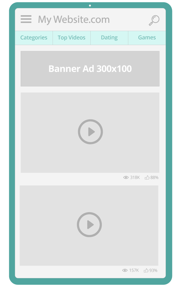
This Publisher has 4 top Menu tabs on their mobile site, from left to right:
- Position 1 : CATEGORIES, Position 2: TOP VIDEOS. These are both the publisher’s quick search tabs for end users to browse the site’s content.
- Position 3: DATING, Position 4: GAMES which are Direct Links available for advertisers to target with Dating offers and Games offers.
Originally the publisher had all of the 4 top Menu tabs looking exactly like the look and feel of the site, like below:

Optimization
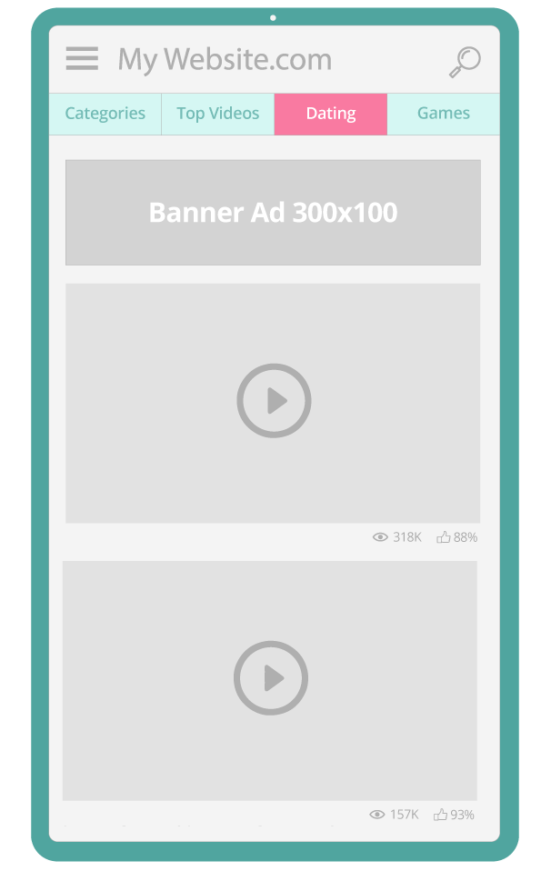
The publishers account manager recommended an optimization to test if a simple change to the Dating Menu tab would increase the tabs clicks. The Publisher kept to the same font and simply changed the background color to red, to make the Tab stand out.

Results
We analyzed the data, comparing how the Dating tab performed for 1 month before the change and 1 month after the change. The Dating Tab in red saw a +162.2% increase in clicks for this ad zone optimization.
Mobile Publisher Case Study #2
In this case study, the publisher also had Games and Dating tabs that he was monetizing as Direct Links. In position 3 he had Dating and in position 4 he had Games. The Publisher wanted to increase clicks on the Dating Tab in order to attract more advertisers with Dating offers, so that he could boost demand for the Dating Tab, increasing the bidding potential of the ad zone.
Optimization
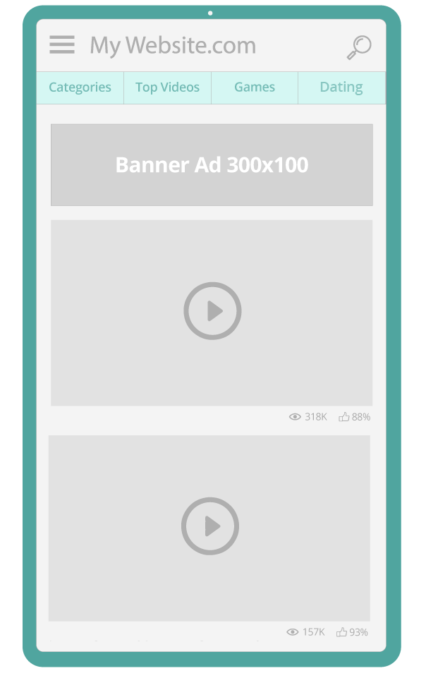
His ExoClick account manager recommended the Publisher swapped the order of the two Direct Link Menu Tabs, placing the Dating in the top right corner 4th position.

Results
We analyzed the data, comparing how the Dating tab performed for 1 month before the change and 1 month after the change. The Dating Tab change in position saw an increase of +52% in clicks compared to when it was in the 3rd position.
The success of the 4th Tab is about visibility and usability, the upper right corner is considered the most important, because the end user’s eye is drawn to it and also it’s physically easier to click on it by the end user with the right thumb.
Mobile Case Study Conclusions
Now you have seen how to monetize navigation Menu Tabs. With a couple of tweaks for optimization, these publishers increased the values of the Menu Tab Direct Link zones. There was of course a price to pay, in the second mobile publisher case study, the redistribution in favor of Dating reduced the clicks on the Games tab by -25.1%. But the purpose of the optimization was to increase clicks and revenues on the Dating Tab. However, both mobile publisher case studies show that with some very easy experimentation click volumes and revenues can be tweaked. So for example if as a Publisher you wanted to attract more Games advertisers you can highlight the Games tab in another color and move it to the 4th position. The following month you could rotate this with the Dating tab to boost awareness of the tab to Dating advertisers and increase clicks and revenues for your Dating tab. This way you can keep refreshing your top performing 4th menu placement regularly to attract more advertisers to test your Menu Tabs.
How to monetize navigation Menu Tabs: More Menu Tab Optimization Tips
Test out different Tab verticals
You can try Casino, VoD, eCommerce, Live Streaming, Dating, Games. This allows Direct Link advertisers more opportunities to test your traffic. Run the tests for a few weeks or months to see which Tabs bring the most clicks from your website end users. That way you can see what Tabs your traffic likes best for a great end user experience. When you see clicks for a specific vertical on a downward click trend for some time, then this will tell you your traffic is tired of that specific vertical, so change it to another, that way you refresh your tabs for maximum user experience and revenues. Important notice: Make sure you inform your account manager before you change the vertical tab, so your account manager can ensure that the right advertiser offer will be matched with your tab. For example if you change a Dating tab to Casino tab and don’t inform your account manager, your end users will click on your Casino tab and be taken to a dating offer.
Menu Tab Emojis
Because Mobile is a small screen, you are limited with the number of characters you can use on a tab. For example, if you are using Menu Tabs in different GEOs, bear in mind that some languages use a lot of characters when translated from English. One solution could be that you use images or emojis for the titles of the Menu Tabs, so Dating could be a Heart with an arrow emoji 💘, Games could be the games console emoji 🎮, that way you can keep the short English vertical text, but emojis make the vertical instantly recognizable for end users internationally.
Menu Tab Naming
Instead of simply calling your Dating Menu Tab Dating, why not try CTA phrases such as ‘Meet a Date?’ ‘Looking for love?’ For a Games Tab you could use phrases like ‘Play Time’ or ‘Fun Zone.’ Experiment with these to see if the phrases get you more clicks.
Number of Menu Tabs
In our case studies, the publishers used only the 4 top Menu Tabs and only 2 of them were for advertiser offers. This is a good proportion to have on a mobile device. You have to remember that fingers and thumbs do not have as much precision as a mouse would on desktop, therefore some clicks on mobile menus may be by accident and not be qualified clicks. Advertisers love qualified clicks because they are made by the end user as an intentional action, showing genuine interest in the vertical on the Menu Tab. Taking the example of the second mobile publisher case study above, perhaps one order to test could be 1st position Categories, 2nd position Dating, 3rd position Top Videos, 4th position Games. This way, the end advertiser offers are spread out and less likely to get mistaken clicks from large fingers and thumbs. The drop down burger menu offers more space for extra tabs, you could experiment with these placements too.
Conclusion
We hope that this has shown you how to monetize navigation Menu Tabs on mobile. Advertisers are always looking for new premium tabs across various GEOs, so there is a lot of demand. This is a great way to add extra revenue sources for your mobile site while maintaining a great user experience. If you have high quality traffic and are interested in implementing Menu Tab Direct Links on your website please contact your account manager or a Customer Success specialist here.